I'm Kim, a Dutch
Product Designer
living in
Berlin
I work at Zalando where I design excellent experiences for our B2B users. I love to simplify the complex, and enable everyone to get the most out of anything I design.
How I work
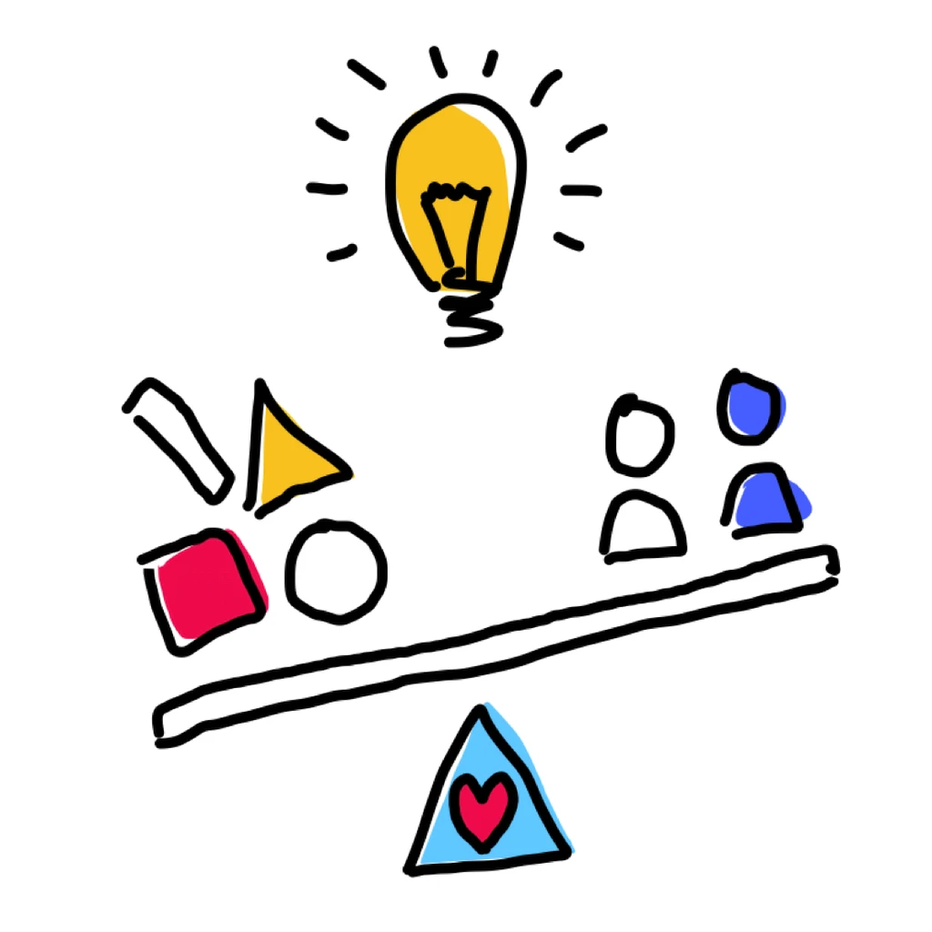
With plenty of experience in balancing both the user, and business needs, while keeping technical (im)possibilities in mind, I am able to design the right solutions that are great to use.
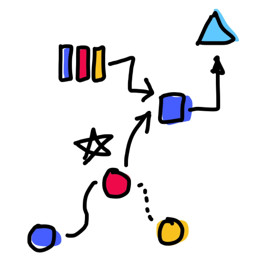
I love to dive super deep, both into complex subject matter and the users. I then take all that knowledge and zoom out to get a birds eye view. I look beyond the feature or project itself but consider the entire picture.
Working as a principal designer I don't only work as an individual contributor but also strive improve the overall (design) processes and raise the bar for those around me.
Want to see some of my work? Have a look at my portfolio or get in touch.
How I got here
I've been working as a product designer since 2010.
I studied Artificial Intelligence (B.Sc.) and Human-Machine Communication (M.Sc.) which laid a solid foundation for both my career and day to day nerd-ery.
I
started working as a consultant for large companies (ING, Alliander) before making
my way to a Berlin startup (txtr) and ending up at Zalando. I started at an internal
start-up (Zalon by Zalando) before switching to a B2B2C team in spring
2021.
Looking for more
details? Have a look at my LinkedIn or get in
touch.
Portfolio Overview
Some of my projects
Payments and returns
Simpifying payments and returns for Zalon by Zalando customers.


Sepa Payments
Redesigning the fundamental payment flow at ING Bank from scratch.
Time and Leave registration
Introducing Alliander to design thinking with a showcase project to redesign the time and leave applications.

Want to know more?
Get in touch!
Portfolio Cases
Diving deep
Zalon by Zalando
Payments & Returns
Goal
In a
large customer satisfaction deep dive we discovered that
one of the biggest challenges that our customers faced
was how to return clothes & pay for the clothes they
were keeping. With this project we wanted to remove this
challenge.
Background
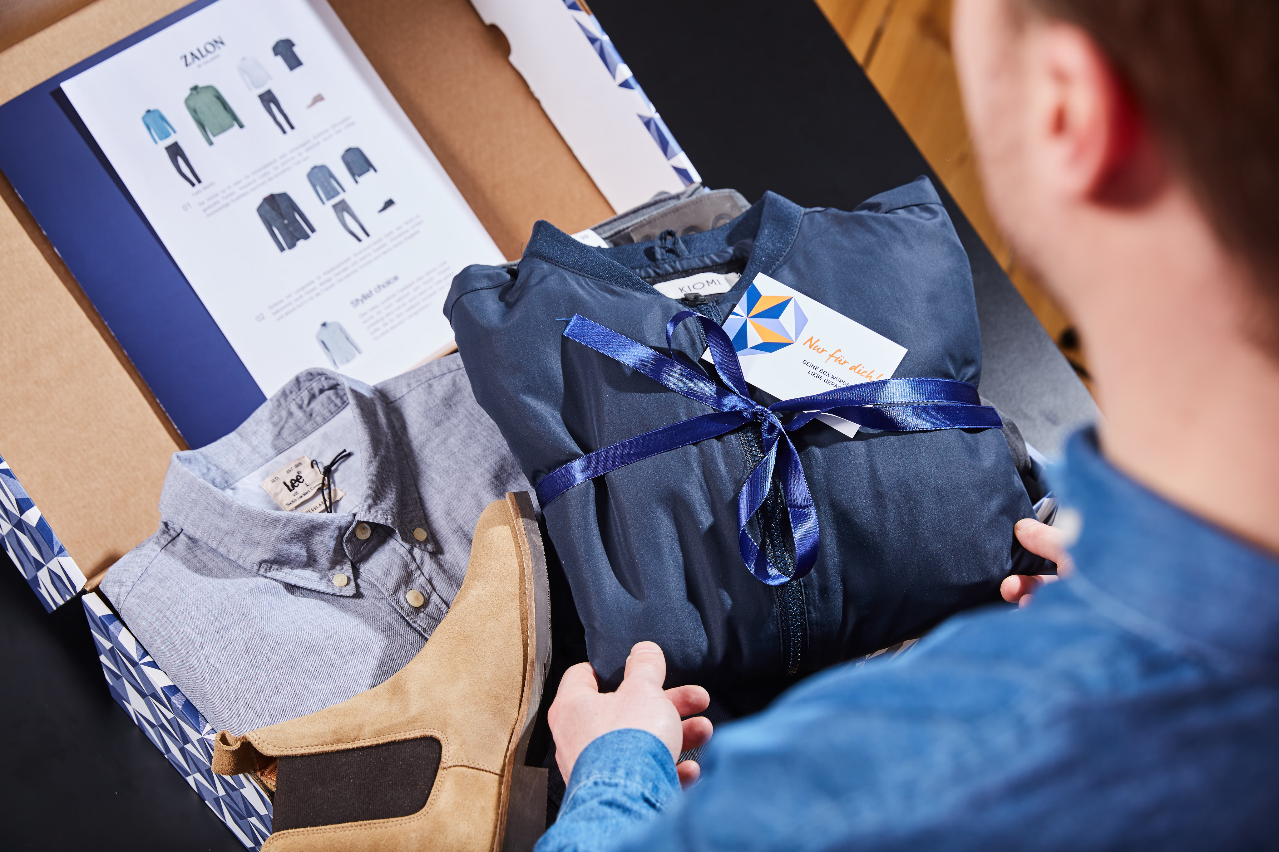
Zalon by Zalando
was a personal styling service. Customers answered a
survey about themselves, and their preferences and a
stylist would style two outfits for them and send them
to the customer. The concept was only pay what you keep,
meaning customers did not pay anything up front.
Role & Deliverables
Role: Product
designer
Deliverables: Discovery
research, concept design, co-designing with engineering
and product team, wireframes, prototype, competitor
analysis, user research, interaction design
specifications, collaborating with the engineering
during delivery.
Description
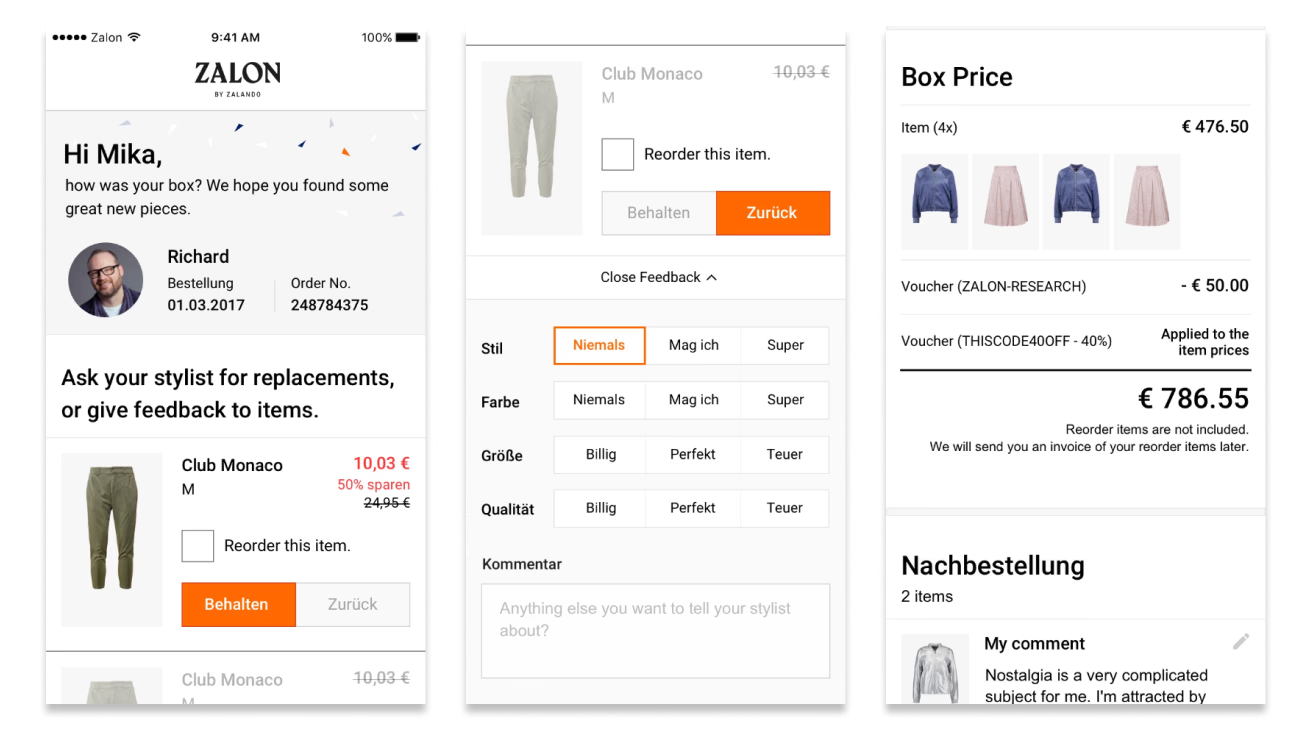
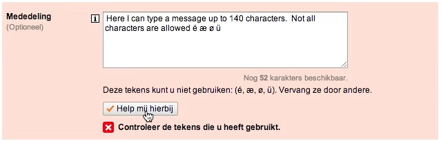
In our customer satisfaction deep dive we found that customers had challenges understanding how to pay, and how much to pay. Many customers were waiting until we sent out payment reminders to pay us.
Besides this being a suboptimal customer experience, it was also causing business problems. With a delayed payment rate, relatively high losses due to non-payment, and payment systems preventing re-orders (e.g. different sizes and colours of items) due to open balances.
After gathering all the materials to understand the current process and it's performance, the challenges customers were facing, and a competitor analysis I led a team kick off for this project.
This project was done with involvement from the entire team from the start: meaning that the kick offs and initial ideation sessions were done between design, product and engineering. This allowed us to immediately be aligned, and generate a diverse range of potential solutions.
Once we identified what our main goals were with this project, we narrowed down our solution space and compared impact versus effort of the potential solutions.
We then did additional research to get even more rich customer insights. We visited real customers at home as they were unpacking their Zalon box (which they had ordered independently from the research).
We observed them unpacking while they talked out loud. Following this we had a small interview, and showed them several (sacrificial) concepts based on our initial design iterations.
This was the first time we had visited customers at home, and we gained numerous insights, not just related to this project but the customer experience as a whole.
As we were moving towards a solution, our sponsors unexpectedly asked to broaden our scope. Rather than focussing on optimising payments and returns, also make sure we still gather enough feedback about the sent items. While the combination of the three topics made sense for customers, it did complicate designing a solution for it.
Following the changed scope, we went back into understanding mode. We established base line numbers for the current feedback, and reviewed all customer feedback about feedback. With these added insights we went back to the drawing board and started new iterations of the solutions.
Once we had a solution we believed could tackle all three goals, we created a prototype and performed usability testing. Following the outcomes from the research we created a final concept.
Rather than implementing the entire concept, we sat down with the entire team and did several rounds of scoping, discussing and slicing. The impact of this problem was so big, that it was important to deliver and start learning as soon as possible.
Once we delivered our first our first release we continuously monitored performance of different parts of the solution. The final outcomes were mixed, which was not surprising as we had three competing goals. We managed to reduce re-order cancellations, dunnings, and payment contacts. As a negative we also reduced the amount of feedback on the items, and consequently reduced the reorder rate.

ING Bank
Sepa Payments

Goal
With the
introduction of the new SEPA payment protocol ING had to
rebuild the payment screen (and associated backend
systems) to allow for these type of transactions.
Instead of only doing the necessary work it was decided
to improve the customer experience as well.
Background
ING is one of the largest banks
in the Netherlands, employing 26 000 people and
servicing 8.9 million customers. The internet banking
environment is used by 4.4 million customers and is
visited 1.3 million times per day.
Role & Deliverables
Role: Interaction
designer
Deliverables: Concept
design, wireframes, prototype, interaction design
specifications, support for scrum team during
development.
Teammates: Leon
Coolegem (UX for the second year), Marc Smeehuijzen (UX
for third year)
Description
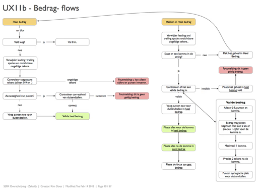
The ING had a several flows for completing payments (national, European, international) in order to make completing a payment as simple as possible we decided to design a singe screen which could complete all payments. In doing so saving the user the effort of determining the type of payment. By making the behaviour smart the user would only have to fill out the necessary information for the type of payment they were making.
Additionally a lot of effort was put into making all fields as smart and assistive as possible; allowing for easy completion of the form by the user. Examples include automatically updating the country field after an IBAN was entered (an IBAN contains the country), showing a flag for all countries for easy recognition, an amount field aimed at preventing entry errors, error recovery for "illegal" symbols in the description field and many more.
The design was prototyped using iRise and tested in a usage test. Users were able to use the form quite well but were distracted by the limitations of iRise prototyping environment (flickering of the screen, no dynamic data usage). Given the limitations of iRise the next usertests were done using an HTML prototype which was much better able to test the dynamic and interactive nature of this design. Results were generally good and the assistive functions were appreciated and used.
Even though the designs were effective the team was not able to build what was initially designed. Mainly due to the underestimated complexity of the changes that needed to be made to the backend services to allow SEPA payments in the system. As the project was running well past its completion deadline the 1-form-for-all-payments part of the design was put aside. However most of the smart fields were able to be built. The new form is currently being released to all ING online banking customers. I was involved in the mobile designs of this form.
Alliander
Time and Leave registration
Goal
In order to optimise Alliander wants to digitalise all internal processes and improve existing ones. They are using several out of the box SAP applications, the user experience and usability of these applications is quite low.
As an initial project it was chosen to improve the Time and Leave registration. Currently only a small number of employees do this digitally, others use paper or excel sheets. A good user experience was seen as essential for moving all employees towards this digital process.
Background
Alliander is a network company which manages gas and electricity networks in a large part of the Netherlands. In addition they design and realise complex energy infrastructures. The company has a staff of circa 6 000.
Role & Deliverables
Role: Interaction designer
Deliverables: Field and desk research, personas, usage scenarios, design principles, wireframes, html prototype, short prototype video, user tests, and interaction design specifications.
Teammates: Susanne van Mulken (project lead), Jeroen Elstgeest (interaction design), Frank Volmer (prototyping).
Description
We started by analysing the existing situation and the wishes of our client. We did this by looking at the application and conducting interviews with employees in different roles and locations. During these interviews we also observed the employees using the system.
Throughout the project we had twice weekly meetings with the client to show our findings / deliverables and get feedback on the progress.
Based on the client input, the expert review, and information we gathered through interviews and process analysis, we created design principles and a set of personas. We used these throughout the project to keep ourselves focussed and to make the design process more tangible for the client.
Using the design principles and the personas we started sketching and quickly iterated different solutions. We had several sessions with employees to get feedback on the designs.
Keeping in mind the technical posibilities of the clients system (the backend would still be a SAP system) we started prototyping our designs. During the prototyping phase we kept iterating and developing the design.
Once the prototype was completed we held a series of user tests. This was once again done with actual employees from different parts of the company, ranging from managers to gas fitters. We used the results of the test to further refine / adjust the designs.
The prototype / designs were then used to complete the interaction design documentation.
Want to know more?
Get in touch!
Copyright© 2023.